QR tasting-room experience · Kentucky
Whiskey Thief: Every barrel has a story.
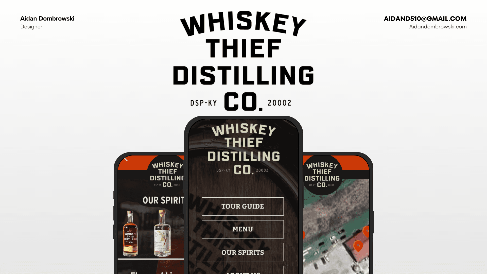
An interactive digital platform for Whiskey Thief Distilling Co. that puts the bourbon, cocktail, and food menus, a tour guide, and the distillery's story one QR scan away. The design had to feel as handcrafted as the spirits while staying fast and readable in a dim, busy tasting room.
UX/UI case study · DSP-KY 20002
- Category
- UX/UI Design
- Timeline
- 2025
- Menus: spirits, cocktails, food
- 3
- Step visitor journey
- 5
- Visitor outcomes designed for
- 5
- Scan-to-open, no download
- QR
My role
Research, strategy, and design, start to finish.
- UX Research
- UX Strategy
- UI Design
- Visual Identity
- Prototyping
Built with
Tools and formats behind the experience.
- Figma
- Mobile Web
- QR Access
- User Journeys
The Pour
Project goals
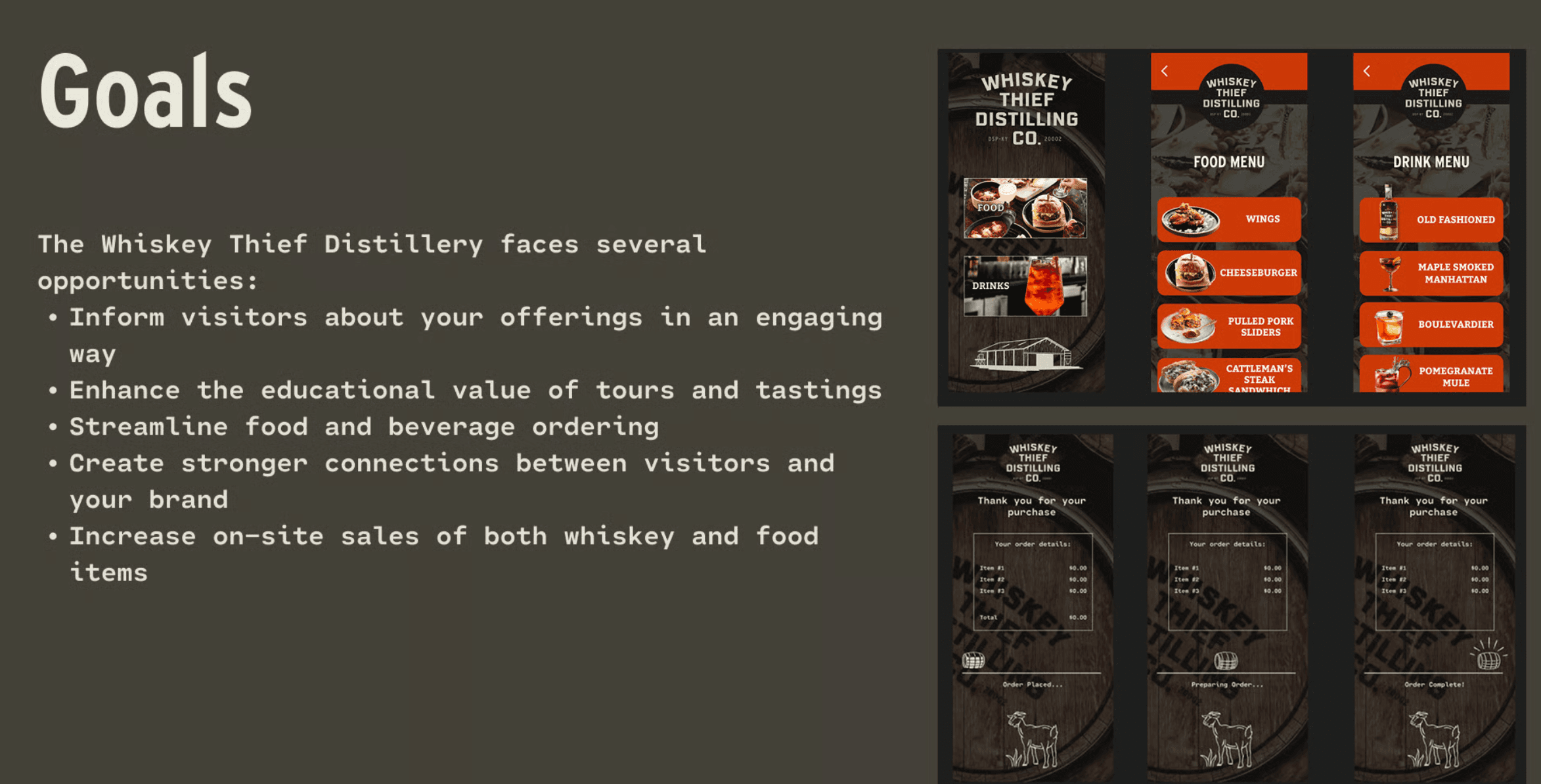
The distillery saw an opportunity to do more with every visit. The platform needed to:
- Inform visitors about the distillery's offerings in an engaging way
- Raise the educational value of tours and tastings
- Streamline food and beverage ordering
- Build stronger connections between visitors and the brand
- Increase on-site sales of both whiskey and food
The Mash Bill
Research & discovery
The tasting room set the constraints. Designing for it meant accounting for:
- Lighting that varies widely, which calls for high-contrast interfaces
- Guests browsing in groups, so text has to read at a glance from different angles
- Staff pointing guests to specific items without taking their phones
- Tasting notes and heritage stories that guests genuinely want to explore
The Journey
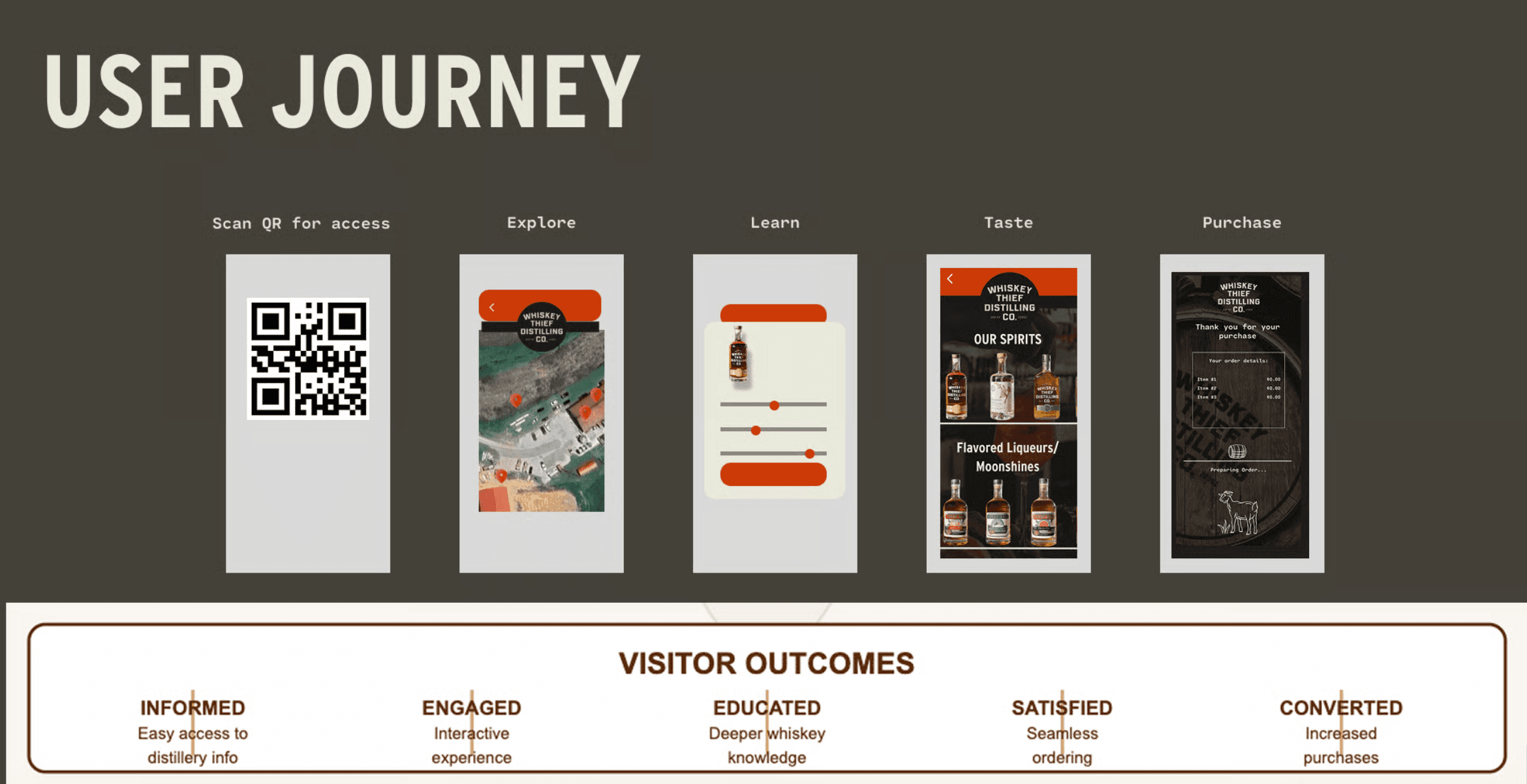
Scan, explore, learn, taste, buy
I mapped the visit as a five-step journey, from scanning a QR code at the table to completing a purchase, each step aimed at a visitor outcome: informed, engaged, educated, satisfied, and converted.
The Label
A design aged in oak
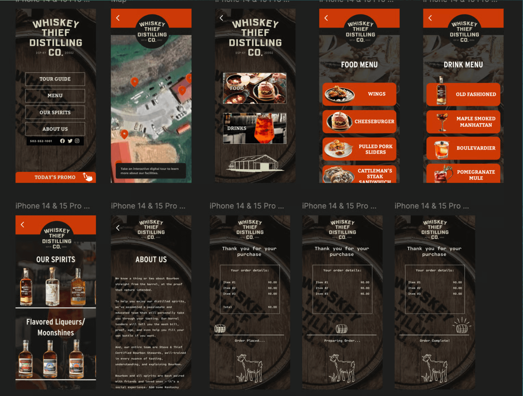
The visual language borrows from Kentucky bourbon culture: barrel-wood textures, rust and amber tones, and bold slab lettering that echoes distillery signage and bottle labels, while staying modern and readable on a phone.
- Quick access to flights for newcomers exploring the selection
- Detailed tasting profiles for connoisseurs
- Cocktail menu with ingredient breakdowns and pairings
- Food menu organized around bourbon pairings
- A self-guided tour with a map of the grounds
The Finish
Built for the room
Every decision was tuned for in-venue use: a dark interface to cut glare in the dim tasting room, large touch targets for guests holding a glass, and lightweight pages that load quickly on a weak connection. The result is a menu that tells the distillery's story without getting in the way of the people pouring it.
Let's pour something new.
Let's discuss how I can help bring your project to life.